
Make Sure Your Website is Mobile-Friendly

According to the initial ‘Mobilegeddon’ update that released on 21st April 2015, mobile-friendliness has been a significant ranking factor in Google search results.
As per Marketing Land report, it has been found that 60% of the internet is now accessed by mobile phones.
Why is a Mobile-Friendly Website Important for Google?
As an increasing number of people have switched to mobiles for internet searches, Google has now started giving more importance to mobile internet users. Hence, In January 2018, Google announced that beginning July 2018, page speed will become a ranking factor in mobile search.
Source: MarketLand.com
The statistics show the number of mobile internet users in the United States from 2015 to 2022.

Source:https://www.statista.com/
What is a Mobile-Friendly Website?
A mobile-friendly website is designed and optimized for mobile device users. Google has now started looking at the mobile-friendly version of a site which in return decides its rank on SERP (Search Engine Results Page).
Is Your Website Mobile-Friendly?
It is quite easy to check whether your website is mobile friendly or not. Google offers a Mobile Site Test Tool (https://search.google.com/test/mobile-friendly), which helps to determine if your website meets the Google Mobile Friendliness Criteria or not.
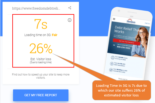
Below is one of our client’s screenshot for reference:

In case, you find that your site does not meet Google’s mobile-friendly criteria, then you need to develop your website in both mobile and desktop version for it to rank in SERP.
How to make your website Mobile Friendly?
To optimize your website and make it mobile-friendly, you need to follow a few steps. Here is the checklist:
Keep in check of the Mobile Page Speed
After the new update from Google in July 2018, Mobile page speed is now an important ranking factor for websites to rank in SERP. Hence, you need to speed up your website enough for it to load in 3 or fewer seconds for all the mobile users. If this is not done, then you might lose your visitors. As per Google research, ‘53% of mobile site visitors leave a page which takes more than three seconds to load.
Use a Responsive Web Design
This is one of the most crucial factors. In Responsive Web Design, the URL of the website stays same, but the webpage will adapt to the design it is viewed from. Hence, we need to practice the following:
- The content should be easily readable on small screen as well as on all resolution
- It should be easy to navigate with one finger
- Should have a standard font
- Does not use flash
- Optimize Image and image size
- JavaScript, CSS or image files shouldn’t be blocked
- Should have Mobile SEO Tools for better optimization
- Don’t use large CTAs
- Text, controls, and images should have proper alignment
- Avoid too many pop-ups
Mobile pages should be checked at regular intervals to see if the system detects your website as compatible for mobile users.
Google Analytics Suggestions
Google Analytics provides suggestions for each landing on a website and most commonly are JavaScript, CSS and Browser leverage. So, if you do the setting for one file, you will see a drastic decrease in suggestions for all other pages. In the end, fix the mobile usability issues on Google search console.
